Those things on the floor
You know what I mean: Those stickers that have suddenly sprung up everywhere, like mushrooms in a lawn after a few rainy days.

This is the reception desk at my local healthcare center. When I walked in yesterday, I found it interesting how impossible it was to ignore the social distancing stickers on the floor. A perfect example of great affordance design (“Here’s how to use the floor.”).

If you’re not up to speed on “affordances,” you might want to take a look at Don Norman’s explanation, or this summary of Don Norman’s explanation. Or if you have an hour to kill, this very interesting academic paper: Affordances: Clarifying and Evolving a Concept.
To vastly oversimplify, an affordance–as the word is usually used in the UX world–is a visual attribute of an object, device, or interface that suggests how you use it. The classic example is a handle on a door that suggests that you pull it, while a plate suggests that you push it.
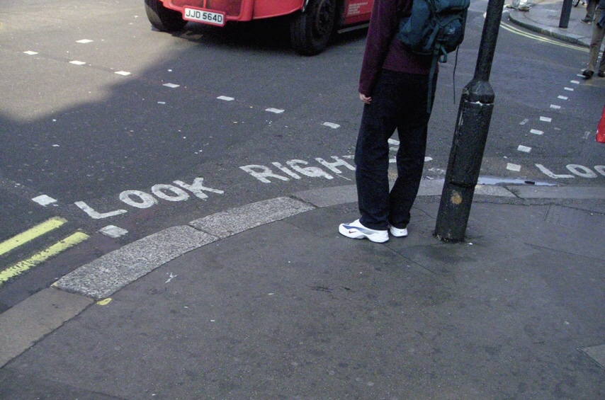
The stickers reminded me a lot of the “look right“ signs (or is it “look left“? I can’t remember, which I guess is the point) on the curbs in London that keep tourists from getting killed.

In both cases, we’re already aware of the message the signs are conveying (“Don’t get too close to people while standing in line” and “Cars may not be coming from the direction you expect.”). We just need a reminder that a) we can’t help noticing, and b) grabs our attention at the exact moment when we need it.
To the people who created the stickers, as my UK friends would say, “Well done, you!” (One of my favorite idioms.)
Surprisingly, I didn’t seem to be able to find anything written about the design of these stickers/decals. But google did turn up this one article about the emerging industry of social distancing consultants, which you might find interesting.


