You know what I mean: Those stickers that have suddenly sprung up everywhere, like mushrooms in a lawn after a few rainy days.
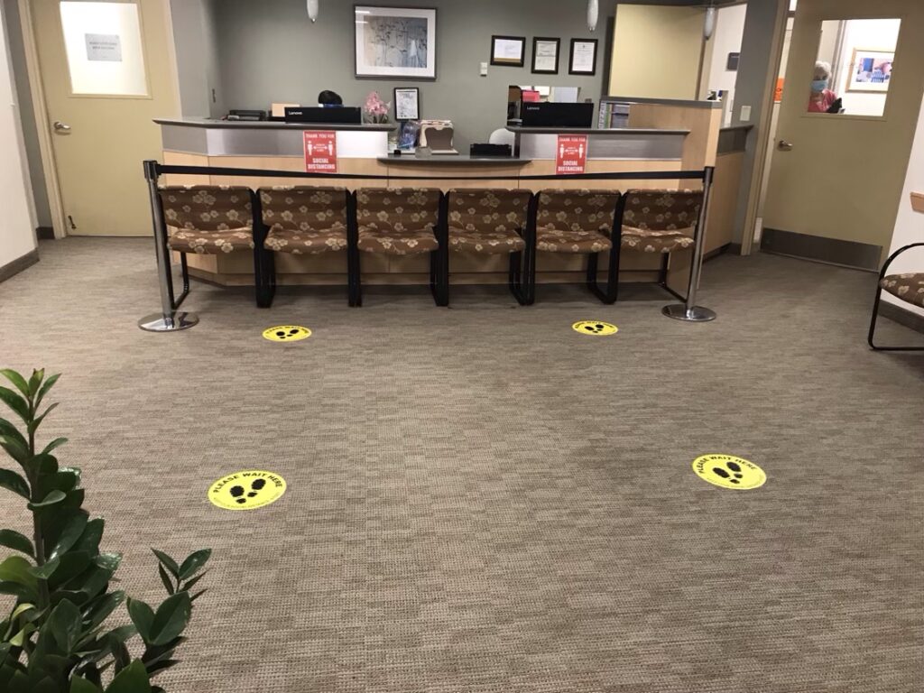
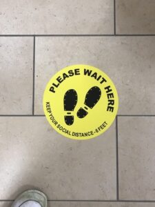
This is the reception desk at my local healthcare center. When I walked in yesterday, I found it interesting how impossible it was to ignore the social distancing stickers on the floor. A perfect example of great affordance design (“Here’s how to use the floor.”).
If you’re not up to speed on “affordances,” you might want to take a look at Don Norman’s explanation, or this summary of Don Norman’s explanation. Or if you have an hour to kill, this very interesting academic paper: Affordances: Clarifying and Evolving a Concept.
To vastly oversimplify, an affordance–as the word is usually used in the UX world–is a visual attribute of an object, device, or interface that suggests how you use it. The classic example is a handle on a door that suggests that you pull it, while a plate suggests that you push it.
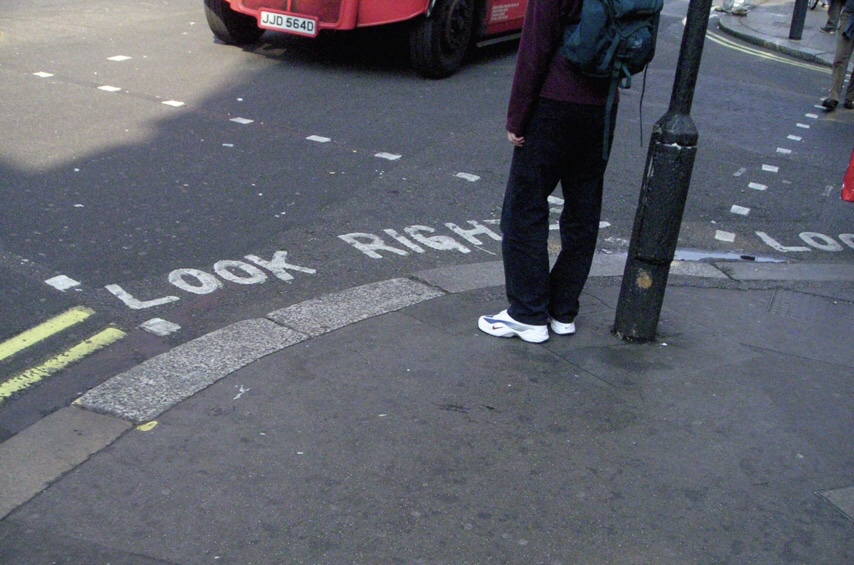
The stickers reminded me a lot of the “look right“ signs (or is it “look left“? I can’t remember, which I guess is the point) on the curbs in London that keep tourists from getting killed.
In both cases, we’re already aware of the message the signs are conveying (“Don’t get too close to people while standing in line” and “Cars may not be coming from the direction you expect.”). We just need a reminder that a) we can’t help noticing, and b) grabs our attention at the exact moment when we need it.
To the people who created the stickers, as my UK friends would say, “Well done, you!” (One of my favorite idioms.)
Surprisingly, I didn’t seem to be able to find anything written about the design of these stickers/decals. But google did turn up this one article about the emerging industry of social distancing consultants, which you might find interesting.
I’m curious about how effective floor markers truly are. There are so many new “nudge-like” designs that have come out during the pandemic, but I, along with everyone around me, still seem to struggle with understanding some of these designs. Perhaps not in the exact case you pictured above, but floor markers can become unclear if you are with someone else (I recently got in trouble for standing next to my friend in a cafe) or if they are not a fluorescent colour.
I think the thing that I see the most abused is the directional floor arrows indicating the flow of traffic through an aisle in a store. Like you mentioned in your post, they serve as a reminder, but it almost seems like wishful thinking that people will follow the routes. The issue is that it really isn’t meant to be a reminder, but rather a command in order to keep people safe. This maybe could be likened to lines painted on the road, but people don’t believe in it nearly as much. I wonder if they would be a safer way to direct traffic to encourage the appropriate flow of people through a store, especially with Christmas shopping increasing the number of people in stores. Perhaps my likening to road paint is unfair as they may not be similar enough, but I wonder what your thoughts are on these nudge designs popping up with COVID. I am also curious about whether or not you think they will stay in a post-pandemic world, as some people do enjoy the added space between people and could help prevent the spread of other airborne illnesses.
You’re certainly right that the one-way aisle arrows are less than 100% effective. What I’ve noticed most is that in some stores (actually, grocery stores are the only ones I’ve been to), it makes a big difference how large the arrows are, since it’s possible to legitimately not notice them.
I’m not sure what a better “enforcement” solution would be. Maybe it’s where I live, but I’ve actually pretty impressed by how much people do what the arrows tell them to. (Although even my wife, a very law-abiding individual, has admitted that on occasion if she’s at the wrong end of an aisle, and what she needs is just a few feet in, she’ll leave her cart and go grab the item. As usual, it’s this kind of gray area that’s hard to manage, since some people would just say, “Well, it’s less than halfway down the aisle. I’ll go grab it.”)
Offhand, I don’t think one-way aisles will outlive the virus, because people just want to do what they want to do. But I suspect–especially during flu season here in the Northeast–that we may all end up continuing to wear face masks in stores and around the office–assuming any of us work in offices again.
Just started reading Norman’s “The Design of Everyday Things”, and I think it’s important to clarify the difference between “affordances” and “signifiers” so as to not perpetuate a misunderstanding of the two. Here is a link to Norman’s explanation: https://jnd.org/signifiers_not_affordances/.
In short, an affordance is an attribute of an object—something it “affords” you to do with it. A signifier highlights an affordance, so that it is made known.
The floor affords standing socially distance with or without the stickers, but the stickers signify a desired use of the floor.
Ahh, so you’ve been reading *carefully*. Good for you!
Don created the confusion in 1988 by a) introducing a very powerful, suggestive word into usability/UX, and b) only clarifying the distinction of how he meant it to be used in an endnote. People found the term very useful (and, to them, clear) and ran with it.
Don then tried to clarify what he *really* meant at various points, including the article you cited, which originally appeared in 2008.
But as far as I know, he never succeeded in putting that particular genie back in its bottle. His distinction is clearly of academic interest (see https://graphicsinterface.org/wp-content/uploads/gi2000-24.pdf, for instance), but AFAIK–the term as originally understood still remains useful and widely used. And–to me at least–“affordances” is a much more compelling word than “signifiers.”
But then again, that’s probably why I never went to grad school. 🙂 Hang in there, and stay healthy.
Just finished *Don’t Make Me Think* and noticed you bring up the signifier vs affordance topic up in the “Mobile” chapter.
I appreciate the perspective. As someone new to UX it’s at least good to know at there are different views on the terms and their use. I can see the value in using “affordance” as a catch-all term—especially if that is it’s most common use.
Personally, I like the term “signifier” when talking about how something *indicates* it should be used, and “affordance” when talking about an object’s *capabilities*. Obviously, all that really matters is for the people on the receiving end of the communication understand its meaning.
Thanks for your response!