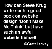
It’s been 10 years since I last redesigned my site.
There, I said it. That feels better.
 Every so often, one of my readers will suggest, ever so gently and kindly, that my site is…well…kind of…sort of…old looking. And about once a year, someone will suggest that it’s…awful.
And personally, I’ve never taken it personally.
For a long time, people said the same kind of thing about Jakob Nielsen’s site. In fact, at one point there were a lot of redesigned versions of his site floating around that people had done for free.
It’s not that I ever thought looks didn’t count. It was more a matter of two things:
- It worked well enough. It did what I needed a site to do.
- I didn’t look embarrassingly bad. (In fact, in a way I kind of liked the way it looked.)
But as usual, even if you’re successfully dragging your feet the world eventually intrudes. In this case, the awful third-party solution I’d been using for years to provide a mobile version finally went out of business, so I finally decided to bite the bullet and use a modern theme with responsive design–and better accessibility–built in.
It was a ton more work than I’d hoped, even with my son Harry working with me, which made it much more pleasant. But I’m glad that it’s done, and that I don’t have to think about it for another ten years. 🙂


It looks like you have some broken some anchor tags from the website redesign. The Downloads page does not have links to download the “mobile site” and “mobile app” usability test scripts.
Thanks, Carlyle! Adding the two additional scripts is definitely on my “punch list” of things to do. I wanted to update them before posting, and haven’t gotten there yet.
You mentioned “anchor tags.” Was that referring to the script links, or were there anchor tags somewhere? (I think I only used two anchor tags, but I may have missed some somehow.)
My career started in 1998 where the only way I could get work was because I created a fancy Flash website that only had my contact, about me and nifty intro animation when the website first pulled up.
“Flash” forward to today and my website was created using WordPress and my homepage is made up a tiled grid of my work.
There is no animation or fancy transitions. The website simply exists for people to see my work. I love simplicity, but because I’m a UX practitioner I have to break down each project which means I’ve had to do some heavy writing to ensure people understood the value of each project.
I used to redesign my website every year. But eventually after creating over 100 projects my goal was simply to make a home for my portfolio to exist. Of course, I’m still an artsy designer so it has to be good enough to feel aesthetically appealing, but there are no bells and whistles. Simple and clean, just what people need.
Built the website using WordPress so that I could learn another way to generate income.
In the end, I think that we are the same in the sense that it does the job its meant to do. Same reason why Drudge Report has never changed. DR obviously looks like it was designed in the early 1990’s. It’s still ranked in the 10.
I direct people to your website all the time when I’m mentoring designers. Gives them some of their sanity back knowing that they spend years trying to nail down UX only to realize that most companies are agile driven and don’t allow for true UX. I’m a big fan of simple. UX should be about common sense and problem-solving in the same vain. But the UX industry is constantly being weighed down by complex exercises that often go no where. If the exercise offers little to no meaningful value to the outcome…….if in doubt toss it out 🙂
Best,
Nathaniel Platts
Did you made your website on your own?