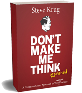
Don’t Make Me Think, Revisited
A Common Sense Approach to Web (and Mobile) Usability
New Riders / 2014 / 3rd edition / 212 pages

Here’s why I wrote it:
After years as a usability consultant helping my clients make their products easier to use, I knew that what I did was valuable.
But I also knew that some of it wasn’t really very hard to do.
I figured that if I could explain how I did it more people could do it, and the products we all use would become less frustrating.
Much to my surprise, it’s ended up selling more than 700,000 copies in 15 languages, and has become most people’s introduction to User Experience (UX).
So, why has it been so popular?
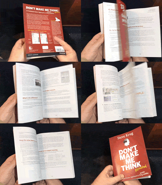
 It’s short. Even though it covers a lot of ground, you can read it cover-to-cover in a few hours.
- It’s profusely illustrated.
- There’s a useful insight on almost every page.
- It’s a great place to start. A lot of people have told me they ended up with a career in UX because they read it in a college course.
- It doesn’t feel like a “tech” book. I’ve always felt that a large part of my job is keeping myself amused, and people have told me they really enjoyed reading it.
Who should read it?
 Developers, designers (visual, interaction, and UI), product managers, Agile team leaders, writers, editors, marketers, and CEOs.
- Anyone with “UX” in their job title, people considering a UX career, and students learning about design.
- Beginners. And people who have been at it for a long time.
In other words, anyone involved in creating digital products will probably be glad they read it.
Thanks to Dr. Carine Lallemand for the flip book idea
Where to buy it
NOTE: Some of these are affiliate links, meaning that at no additional cost to you, I might earn a small commission if you click through and make a purchase.
Try before you buy
FAQ
I’ve been doing Web design (or development, marketing, etc.) for a long time. Won’t this be too basic for me?
As one Amazon reviewer said:
“If you’re new to web design, you’ll learn TONS; if you’re a seasoned pro, you’ll get a solid refresher and maybe even pick up on a few new things.”
A lot of UX professionals tell me they leaf through it again every time they start a new project, just to remind themselves of all the “common sense” that they tend to forget.
What's the current edition? Is there a new one in the works?
I may do another edition someday, but it’s an awful lot of work, so it won’t be soon.
Is this just about Web sites?
Not anymore.
When I first wrote it in 2000, I focused on the usability of web sites because that’s what most people were building.
But in the third edition, I expanded it to show that it applied to almost anything that people use. Web, mobile, and desktop applications are obvious candidates, but it’s just as effective for things like PowerPoint presentations and election ballots.
As Burak Yigit Kaya (@madbyk) tweeted recently:
“I seriously think everyone who builds or participates in building things should read the classic “Don’t Make Me Think” by @skrug.
And I really mean ‘things’ not just ‘web things’.”

